calla.
Client: Calla | Agency: Contrast Creative
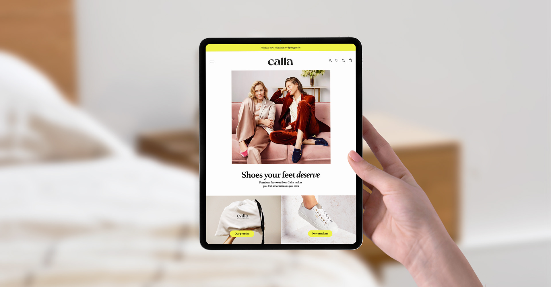
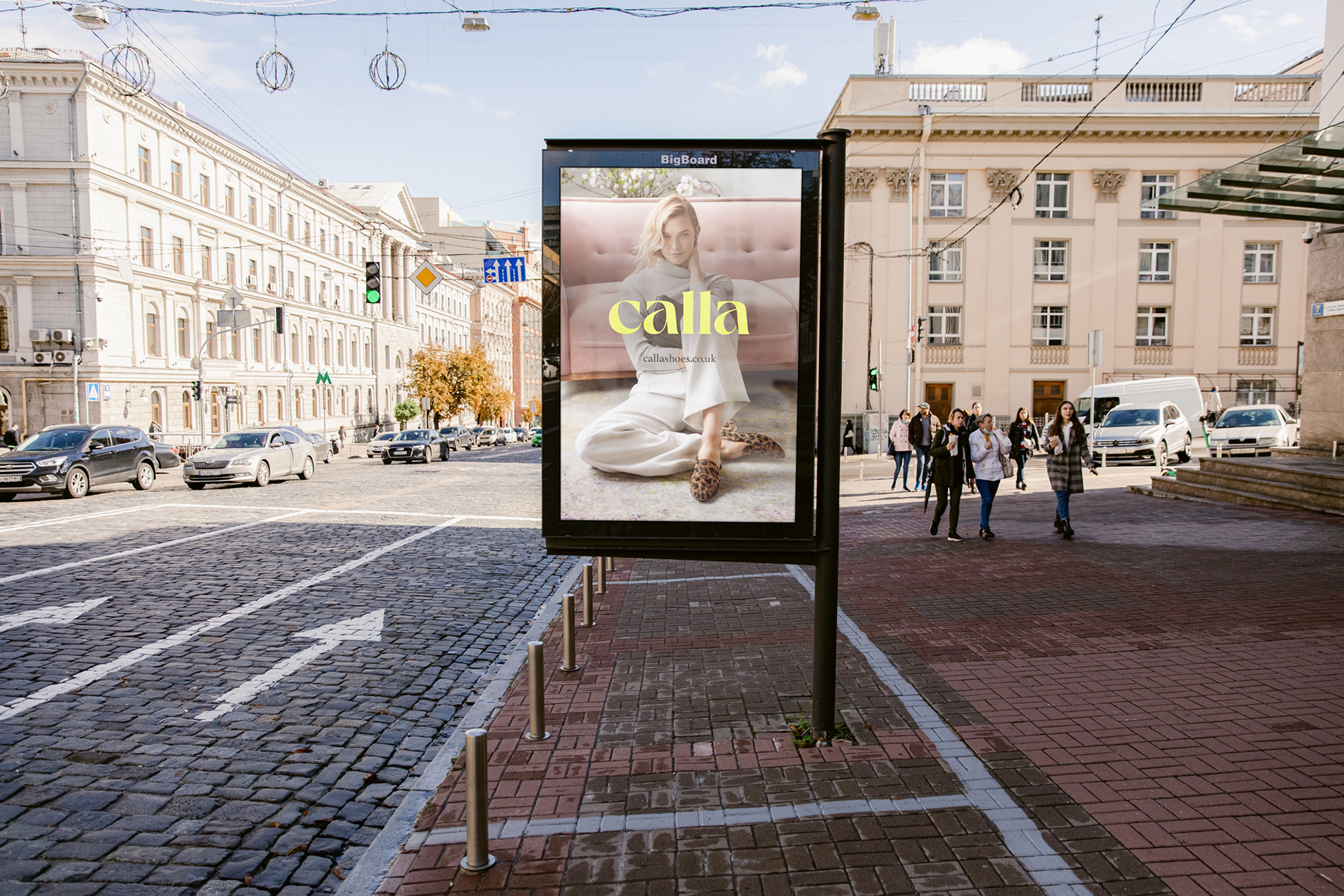
After year-on-year growth, Calla needed to upgrade their branding so that it spoke to their new intended customers. This meant moving away from being seen as a ‘bunion brand’ to being a premium comfort brand meeting both the style and comfort needs of a wider range of women.
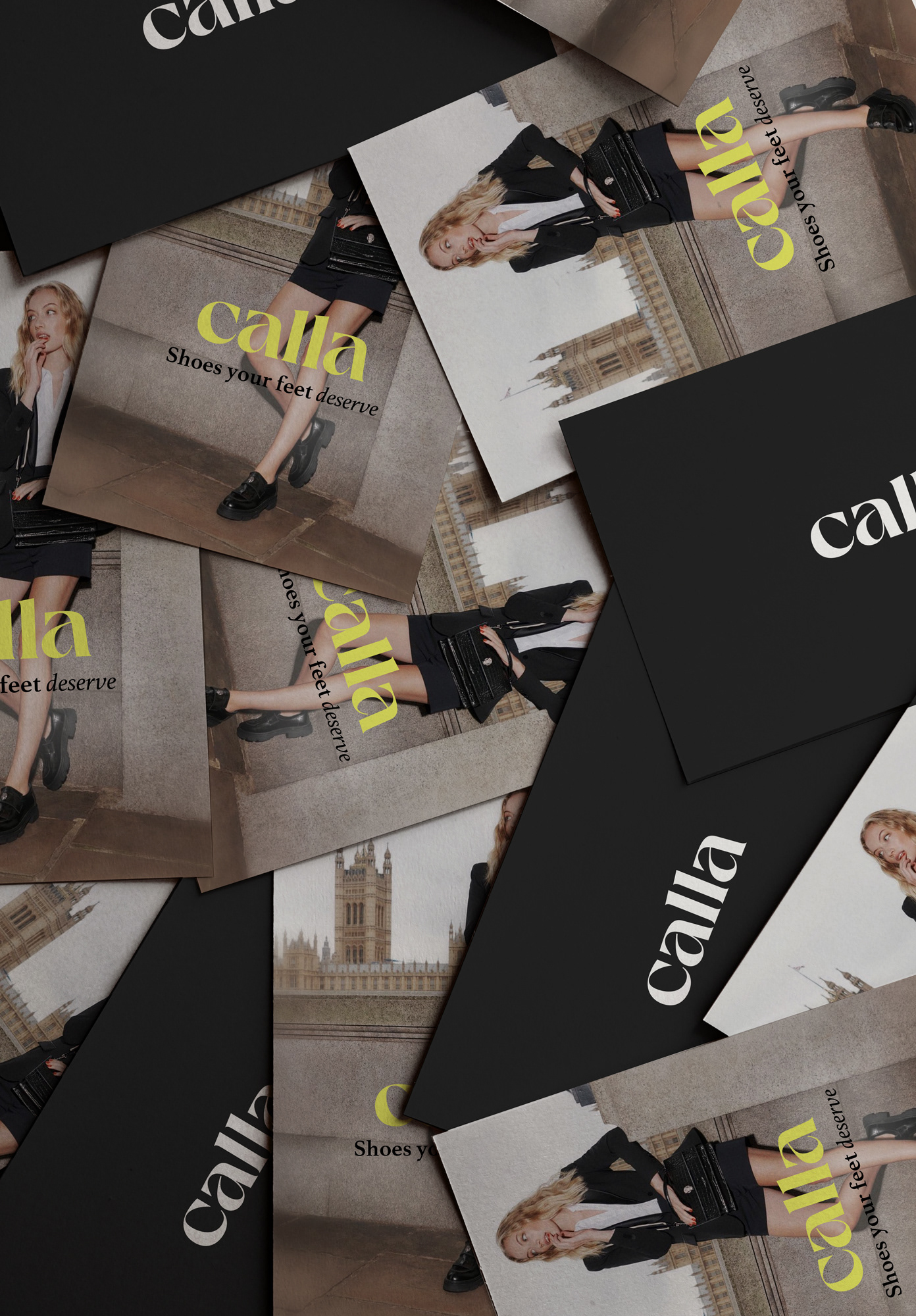
Font choice and adaptation was a huge consideration and one of the most challenging aspects of this design.
As the target audience was shifting, I did not want to alienate existing customers, but as the age brackets crossed generations, associations with different styles would be varying depending on lived experiences.
If the branding appeared ‘youthful’, it would in effect not show loyalty or respect to the established customer base. However, if I played too safe it would not hit the right tone.
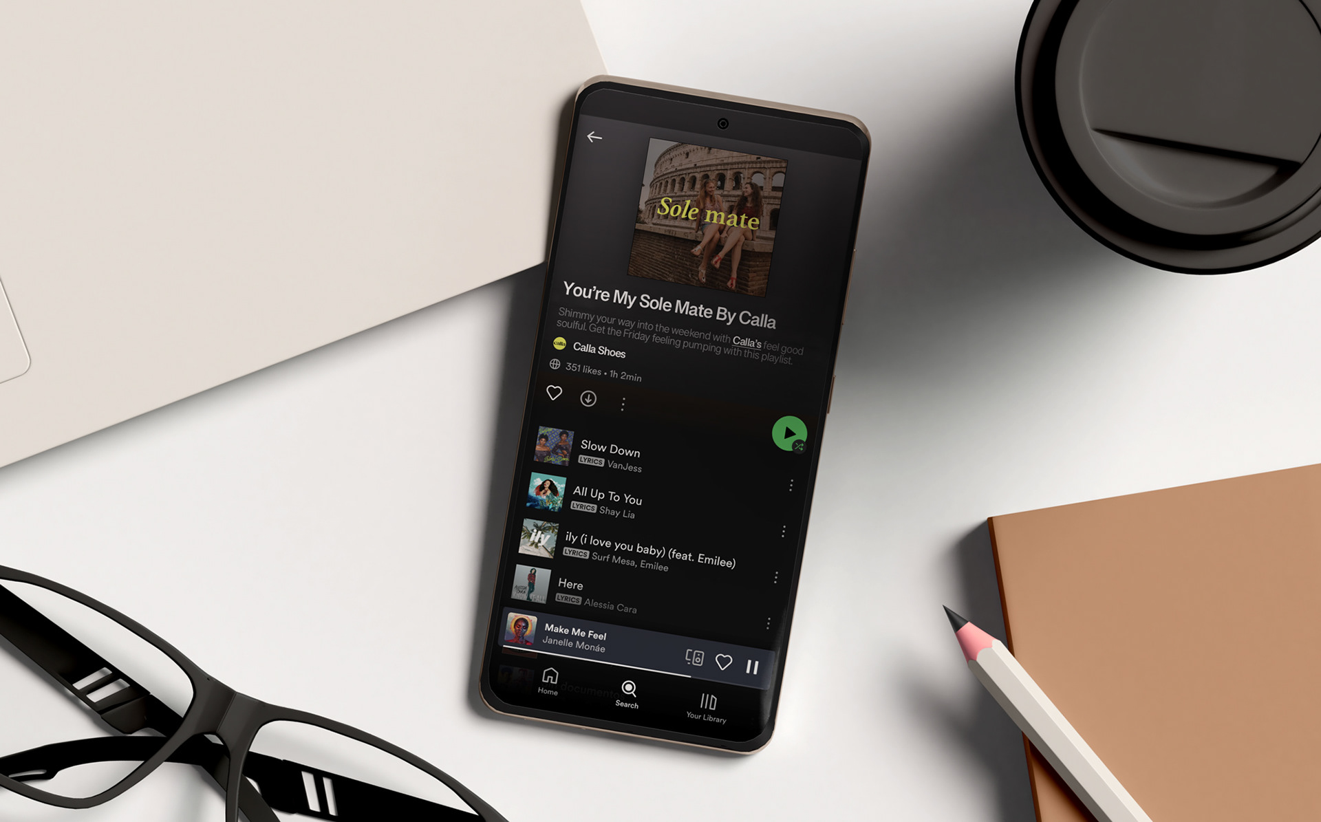
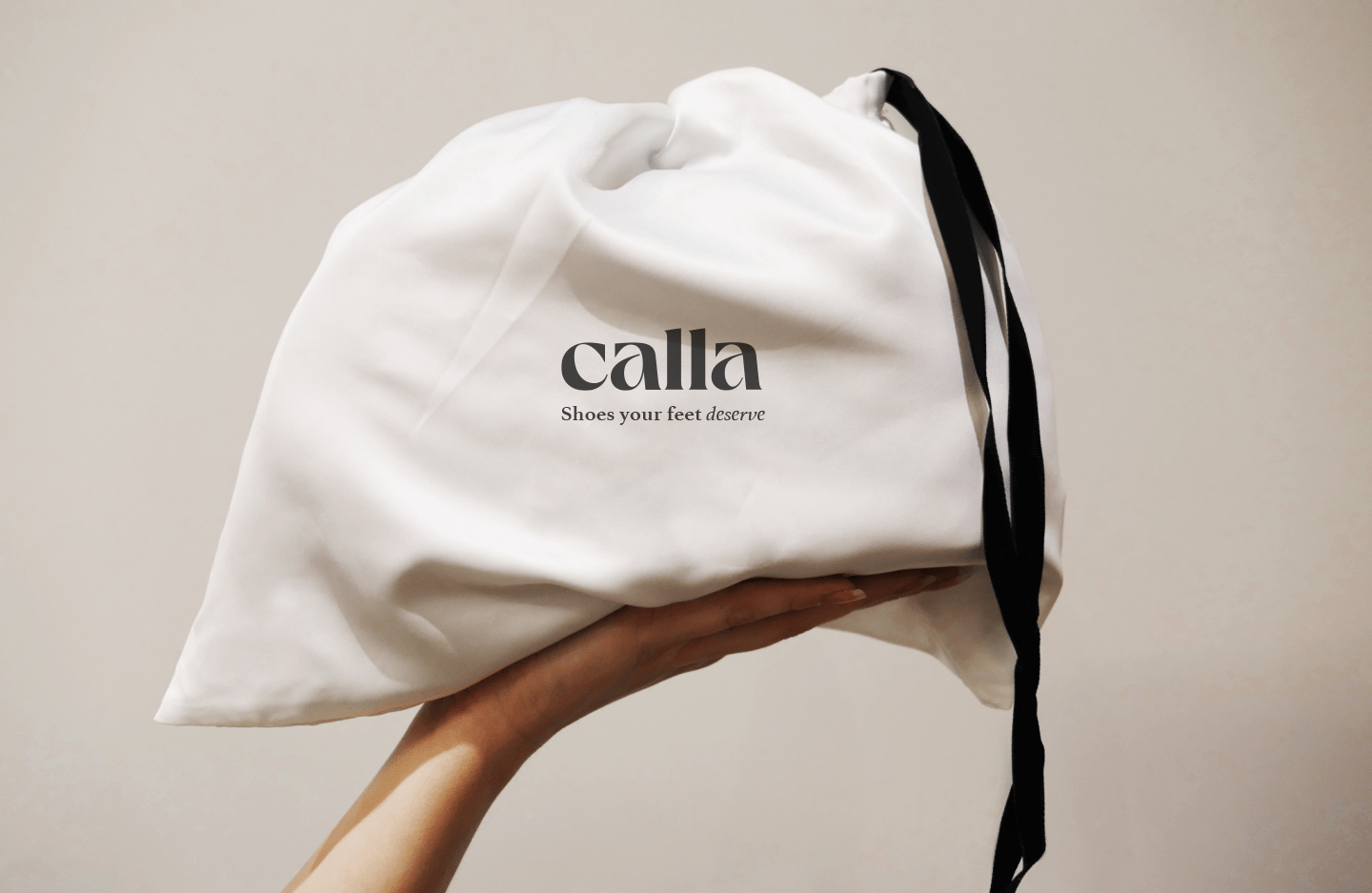
A huge consideration needed to be how the ‘new’ customer would interact with the Calla brand - from purchase to aftercare - packaging and the whole experience was considered and pitched to the client.