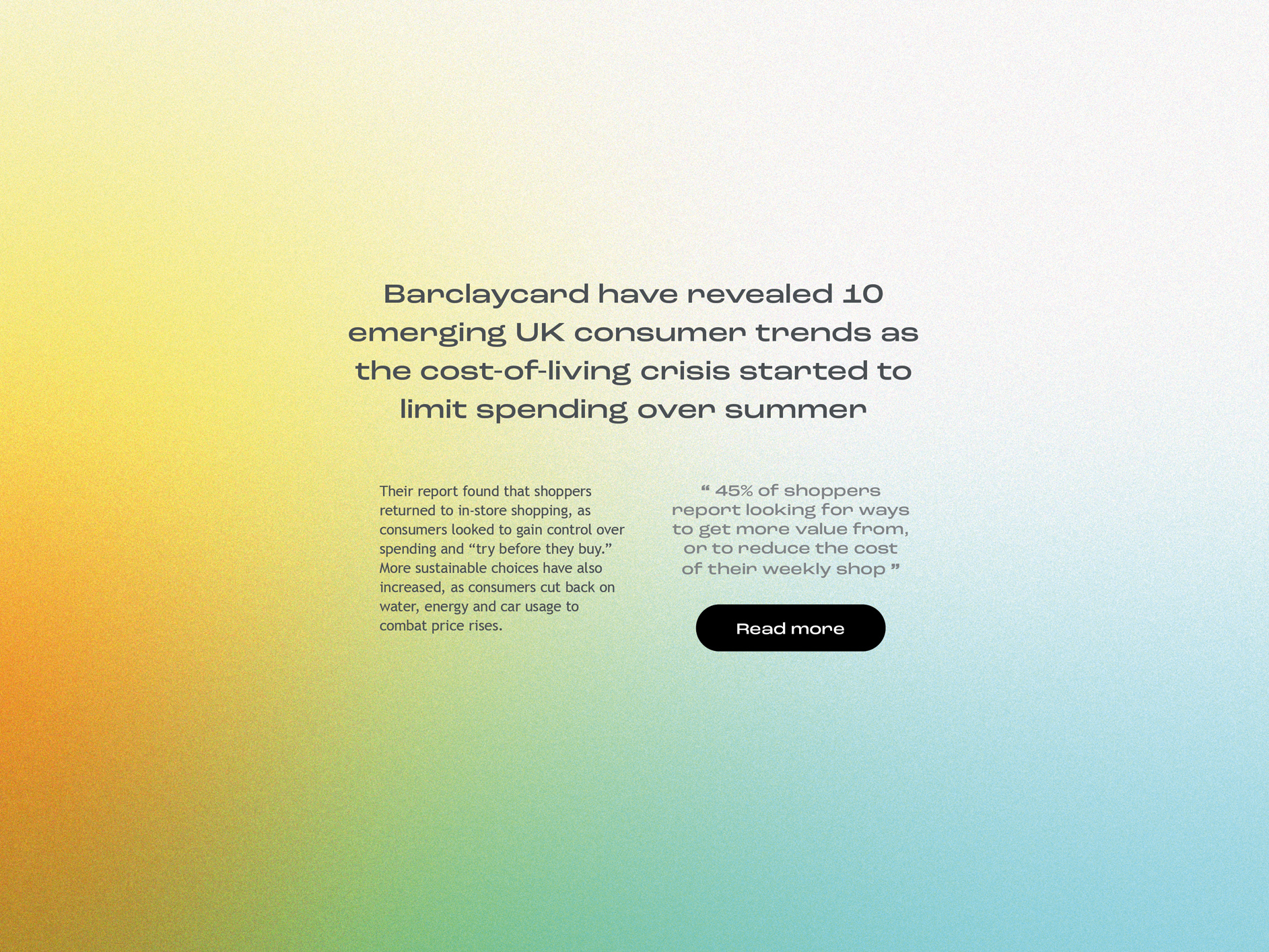
diversity travel.
Client: Diversity Travel | Agency: Contrast Creative
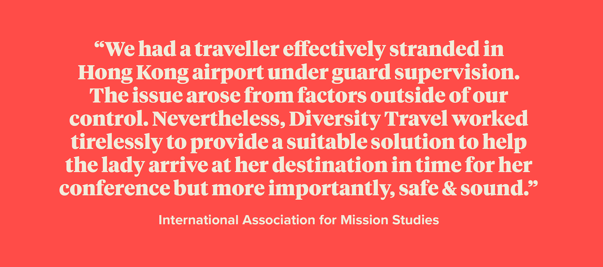
Through the pandemic, Diversity Travel were able to keep their position in the market as the go-to company for business and humanitarian travel. While competitors struggled, Diversity Travel adapted their value proposition and focussed on culture and a forward thinking approach. They needed their brand to be refreshed to reflect these changes and clear brand guidelines developed, without changing the logo.
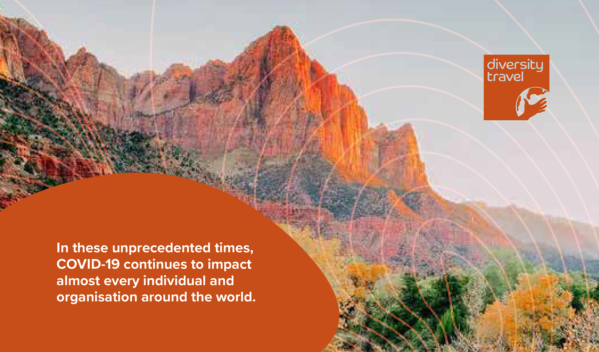

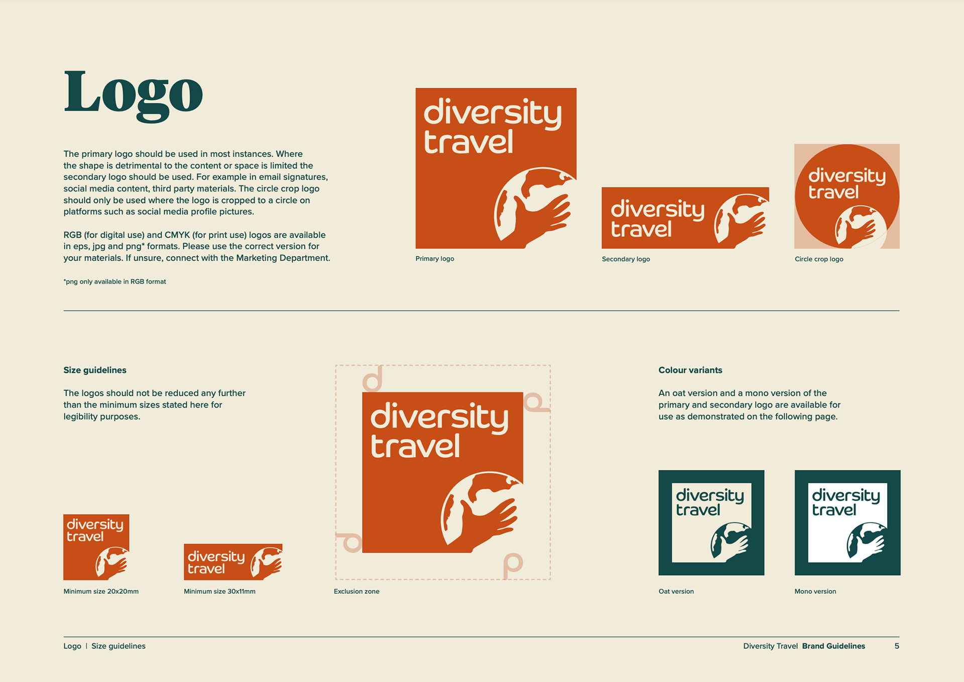
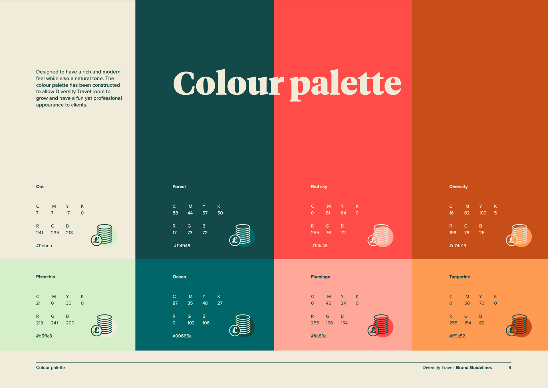
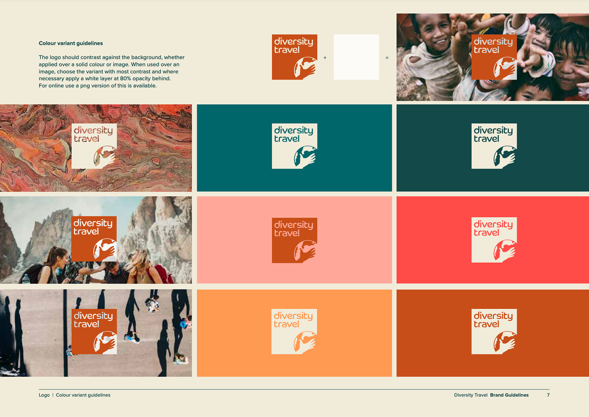
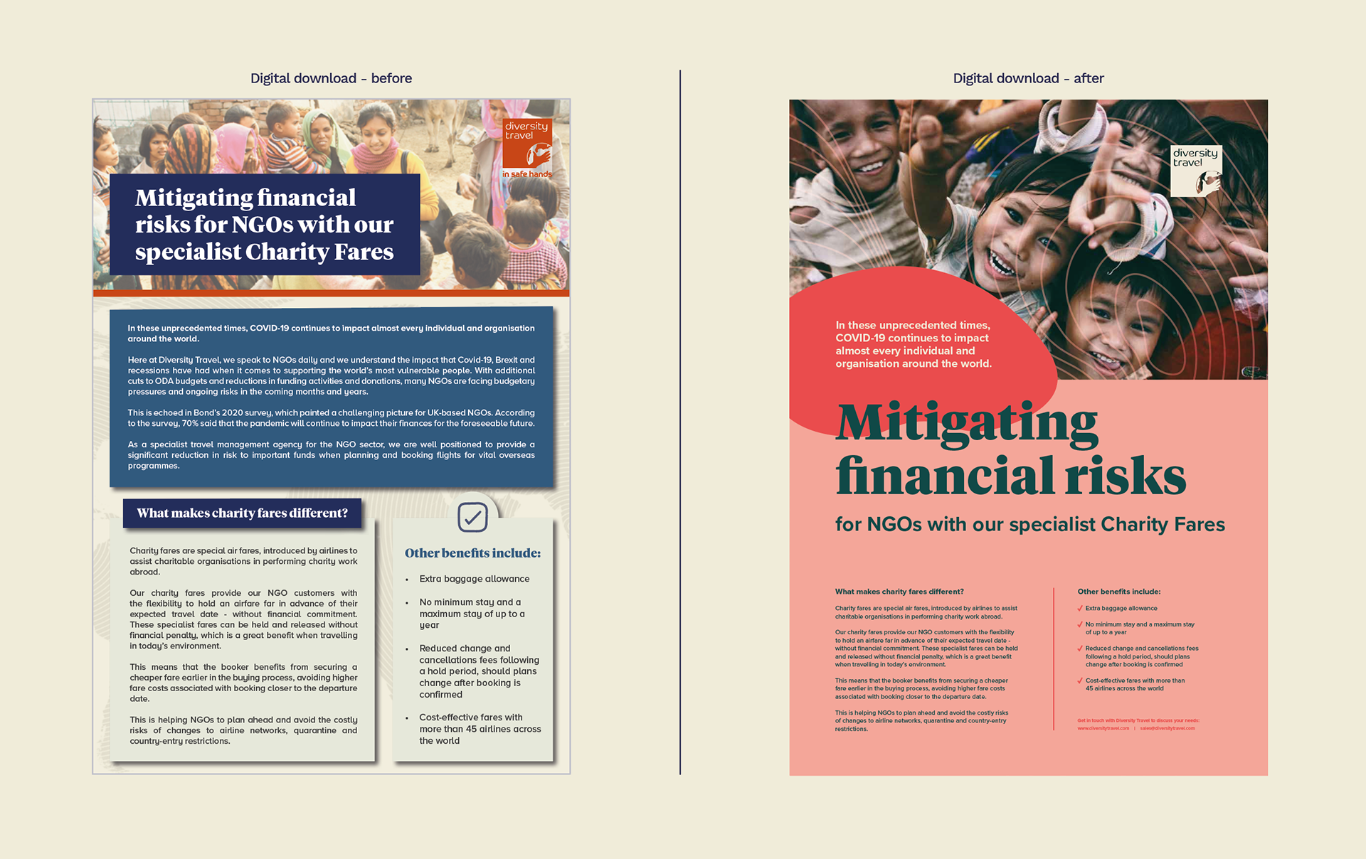
The brand was progressed by stripping away all unnecessary and often ‘clunky’ elements which served little to no purpose. To establish a relationship between people and locations, ‘topoprints’ were created which take the appearance of fingerprints or topography. Brighter colours were adopted as the materials are mostly digitally based and the existing logo and fonts were given definitive guidelines for usage.


Accessibility was a major consideration as Diversity Travel were taking the design in-house after the brand refresh was completed. Taking into account different visual conditions, a guide was created explaining how buttons and text should appear.